Earth’s Mirror
Landsat shows us the home planet, warts and all.
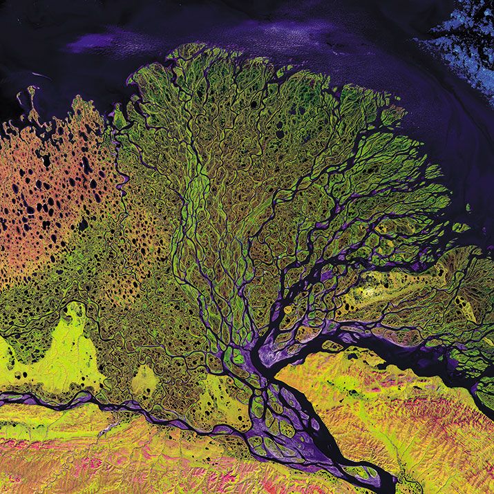
/https://tf-cmsv2-smithsonianmag-media.s3.amazonaws.com/filer/Earth-Mirror-Lena-631.jpg)
From volcanoes to urban sprawl, crop yields to glaciers, Landsat images have for 40 years told the story of a changing planet. Like the satellites that preceded it, Landsat 8, which was launched in February, carries sensors that detect and measure radiation in seven visible and infrared spectral bands as well as an instrument to measure thermal radiation. It will continue the mission of its predecessors: to give scientists a running account of the surface conditions of Earth.
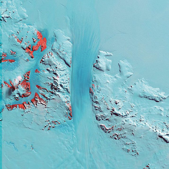
The Landsats have also reached beyond science. They are, says Matt Hansen, a land change scientist and geography professor at the University of Maryland, “a follow-on to those first photos taken by Apollo astronauts.” The environmental idea awakened by seeing the blue Earth hanging in a black void—“Our planet is fragile; we should protect it”—has been intensified by a gallery of Landsat images showing the planet’s diversity and splendor. Says Hansen: “Scientists using Landsat data say ‘It’s absolutely not art. We’re very quantitative. We’re not cooking here.’ ” But Hansen believes that geography is also qualitative. Moreover, the U.S. Geological Survey, which manages the Landsat data archive in Sioux Falls, South Dakota, maintains on its Web site a gallery, “Earth as Art” (eros.usgs.gov/imagegallery). And NASA, responsible for building the satellite and its sensors and launching them, has published an eBook with the same title. Among the book’s 95 images is a picture of Russia’s Lena River Basin, which shows what can be done with the spectral bands of Landsat 7’s sensors. Compare the pretty pictures in these collections, Photoshopped as they are, to the ruddy sameness of pictures sent back from Mars; you may come away with the happy conviction that there’s no place like home.
But the story of change told by the series of seven Landsats is a story of human impact, and that is not a pretty picture. In the 40 years since the first satellite was launched, the number of humans on Earth has almost doubled, from under four billion in 1972 to more than seven billion in 2013. The record preserved in the Landsat archive is the record of loss—of forests, glaciers, and pristine, natural spaces—as humans occupy ever more area on Earth and affect its climate. “We are an impressive species,” says Hansen. “We are everywhere doing stuff. And very few forests are left alone. From Scandinavia to Australia to Chile, Brazil, and back up to Canada—the forests are just used all the time.”
There’s an up side to the story, though, and Landsat is also essential to it. Impressive for their reach and appetites, humans are equally impressive for analyzing and understanding change. Landsat images have been used around the world by resource managers who have put in place practices to mitigate human impact as well as cope with the effects of natural forces like floods and wildfires.
An even sunnier side of the story: Since 2008, Landsat archived imagery has been free and accessible without restriction to anyone in the world. As of August 2012, nine million images have been downloaded.
Change
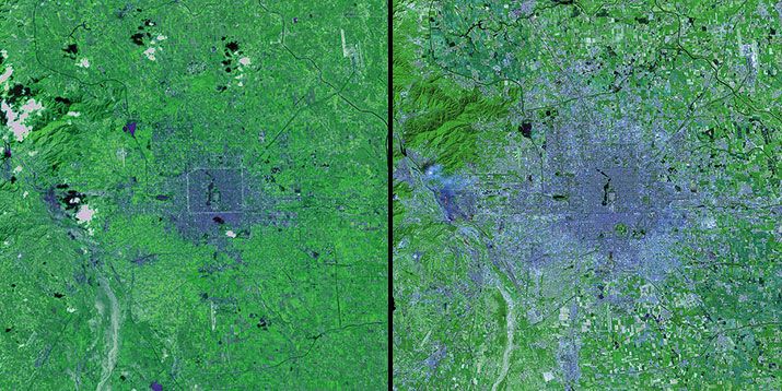
Tom Loveland, the USGS lead of the interagency Landsat science team, has spent a career studying land cover change. Among the most dramatic changes he’s seen are in a pair of images of Beijing.
“We’ve been imaging Beijing and the rest of the planet since 1972, so because we’re looking at it periodically over time, we have this continuous record that allows us to go back after an event and see what was then and how it has changed as a result of the event,” he says.
Loveland points out that the image of Beijing in the mid-1970s shows a compact urban center. Surfaces like roads and rooftops appear blue or gray, surrounded by the green of vegetation. In a 1990s image, the blues and grays have sprawled outward; three concentric circles are visible, the outer beltways of Beijing. Says Loveland: Once the economic engagement with the West began, with the 1972 visit to China by U.S. President Richard Nixon, the satellites began to see the city’s massive growth.
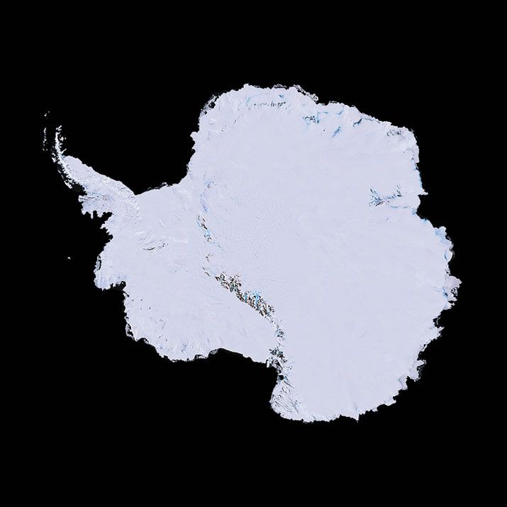
Landsat has recorded surface change not only on the most populated continent, but also on the least populated. In Antarctica, there is simply no way other than satellite remote sensing to keep track of what’s going on, says glaciologist and NASA scientist emeritus Robert Bindschadler. “Satellites can guide field researchers to the places where things are happening,” he says. “Without them, we’d just be flailing in a dark room.” Data from Landsat and other satellites, for example, indicated that the Pine Island Glacier on the continent’s west coast was thinning and accelerating seaward. “We could see that the trigger was at the coast,” says Bindschadler, “and that led to the NASA IceBridge flights,” which made headlines in 2011 with the discovery of a 19-mile-long crack in the glacier, which has by now extended several more miles.
In 2007, Bindschadler led a team to create, from more than 1,000 Landsat 7 images made between 1999 and 2003, the first, true-color, high-definition map of Antarctica. With the Landsat Image Mosaic of Antarctica, anybody with a laptop can cruise around Earth’s emptiest place. Bindschadler got a surprise when the first scientific use of the map turned out to benefit not glaciologists but biologists: Scientists with the British Antarctic Survey used LIMA to find Emperor penguin rookeries. The recorded spectral signatures allowed the biologists to differentiate the penguin guano from ice, snow, and rock.
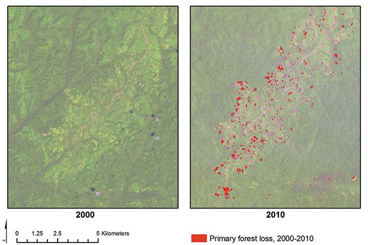
Nowhere on Earth has change been more obvious than in the planet’s tropical rainforests, and Brazil has been the world leader in measuring deforestation and publishing the results. “Brazil decided not to wait for the world to tell them what’s going on,” says Tom Loveland. Every year, Brazil’s National Institute for Space Research collects images from Landsat and other satellites, creates a map of Amazonian forests, and reports the statistics to the world. With these results, says Loveland, the institute has evidence of the effectiveness of their policies for protecting timberland; recent statistics show they’re starting to work.
That means that the loss of forests is being slowed, not that the forests are being replaced. “That’s all you can do,” says Matt Hansen. “How long does it take to re-establish a primary rainforest, with all of its richness? All you can do is lose it. When it’s cleared, it’s cleared. That’s the way we treat it, and that’s the way Brazil treats it.”
Conservation
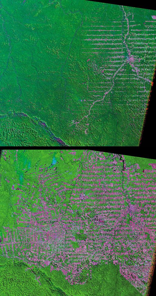
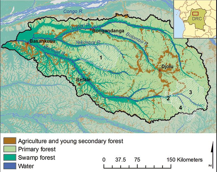
If the world’s forests are to survive, local governments must devise equitable plans for managing the competing demands on them. In the Democratic Republic of the Congo, almost 50 million people, two-thirds of the population, live in rural areas and rely on the land for livelihood. Because villagers clear forestland for farms and depend on firewood for fuel, the forests are gradually declining.
Since 2004, the African Wildlife Foundation has led a program that involves local communities in plans to protect forests from loss in the north central part of the country, home to a large population of bonobo apes as well as other species. Working with the project, Janet Nackoney, a research assistant professor at the University of Maryland, visited the Maringa-Lopori-Wamba Landscape and helps create maps to be used for land-use planning there. Combining Landsat imagery and GPS data with the villagers’ hand-drawn maps of roads, farms, rivers, the locations of chiefs’ houses, and village boundaries, Nackoney and her team help the villagers delineate natural resource management zones that the national government will make formal.
The team has used the satellite imagery to identify corridors joining several wildlife preserves where the loss of forest would endanger the bonobos and other animals. With this information, the team works with the surrounding communities on plans to protect the corridors. “In exchange, our partners help the farmers increase their yields by teaching them about crop rotation and practices to prevent soil erosion,” says Nackoney.
The satellite images (opposite) are also used to monitor deforestation and serve as the basis for maps showing land cover (left). In the Landsat images, darker greens indicate primary forests and swamp forests, where the canopy is intact; agricultural fields are light green; and pink spots show areas that have been newly cleared.
***
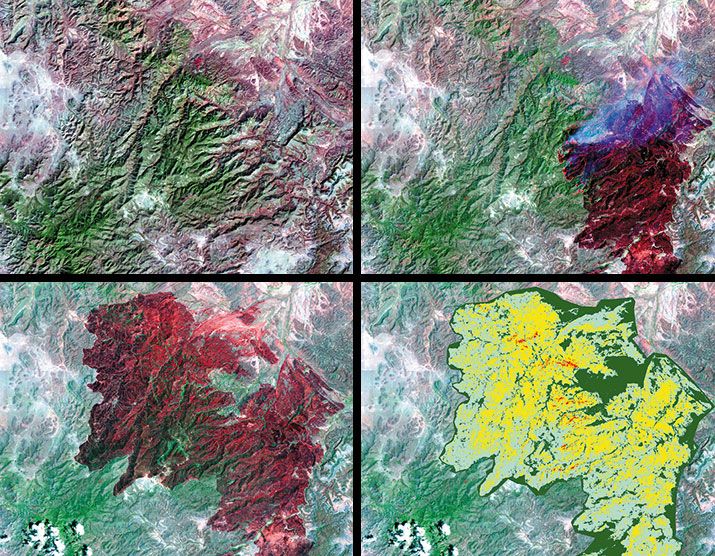
Wildfires destroyed more than nine million acres of forest in the United States last year, a jump over the 10-year average of 6.5 million acres. Most Americans are aware that the U.S. Forest Service works to contain wildfires and protect nearby homes and businesses. But few know that after the fires are out, another kind of firefighting begins.
For the past decade, the USGS and Department of Interior have used Landsat data to show forest service workers where fire damage threatens adjacent developments. If emergency response teams take action quickly, post-fire flooding, mudslides, and erosion can all be prevented.
Light reflected from severely burned soil differs from that reflected by areas where there are still plants and ground cover. Remote-sensing experts have learned that Landsat’s two mid-infrared bands are more sensitive to fire-caused changes in soil than other bands. With Landsat imaging, the forest service is able to generate maps showing four levels of damage, from unburned to severely burned—areas where all the organics like pine needles and duff have burned away and ash predominates. In those areas, fire response teams spread ryegrass seeds, place straw mulch on hillsides, or take some other action to prevent runoff and erosion.
Before 2001, says USGS geographer Randy McKinley, fire perimeters were sketched by teams on the ground or overflying the area in a helicopter; both methods were time-consuming and expensive. “Landsat supplanted the traditional ways that Burned Area Emergency Response teams get information,” says McKinley. With Landsat images, firefighters generate preliminary maps that are usually adjusted with data gathered in the field. But even the preliminary maps provide accurate locations for the perimeters of fires and also show within the perimeters unburned islands that don’t need treatment.
The Landsat archive also provides an atlas of old fires that were never mapped; scientists and environmental groups can study them to determine, for example, whether a fire has made the land more susceptible to invasive plant species.
Context
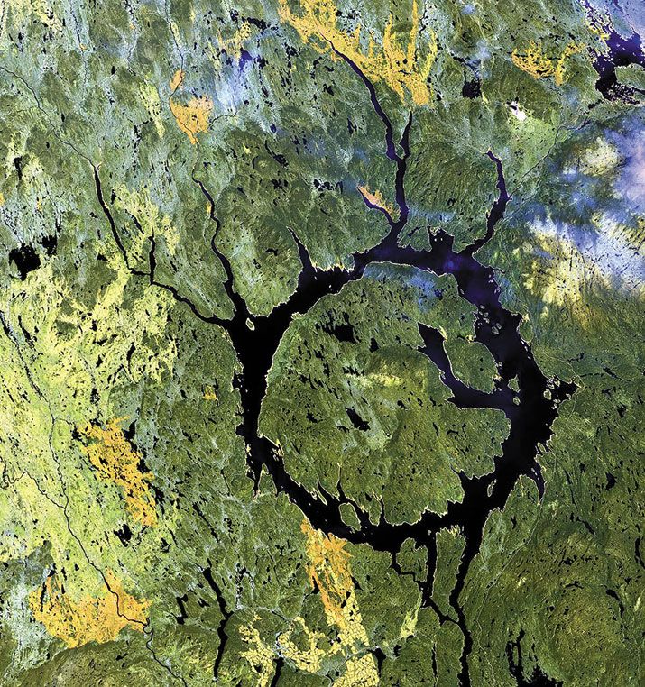
Some geologic structure is simply more comprehensible viewed from space than it is when you’re standing on top of it. John Spray, the director of the Planetary and Space Science Centre at Canada’s University of New Brunswick, is using the perspective offered by Landsat in a 10-year study of the Manicouagan impact crater in Quebec. “We’re a little bit like an ant walking on an elephant or a rhino,” he says. Though small by solar system standards—many impact craters on the moon and Mars dwarf it—Manicouagan is one of Earth’s largest; it hasn’t been deformed by erosion or squeezed by tectonics. “That huge crater was formed in seconds,” says Spray. “If you took the nuclear arsenal of the Soviet Union and the United States during the cold war and let them off in one place in one moment, it would not create as much energy as the energy that formed Manicouagan.
“What we think is totally weird is that the rocks at Manicouagan came up eight to 10 kilometers [five to six miles]—in a minute or two,” says Spray. The central uplift where those rocks now appear could have formed as the ground beneath the impact rebounded, he says , like a trampoline reacting to a jumper. He believes it was helped along by the almost simultaneous collapse inward of rocks and material around the sides of the excavated bowl. “We don’t really understand how rocks move that fast,” he says.
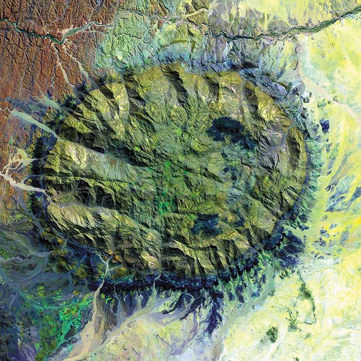
At the other end of the geologic time scale, the Brandberg Massif in central Namibia rose from the surrounding plain over a period of hundreds of thousands, if not millions, of years during Earth’s Cretaceous period, around 100 million years ago. Geologists call it a granite intrusion. It too is the result of almost unimaginable forces. The ancient surface bulged up because molten rock under pressure pushed through overlying layers into a zone of lower pressure. What drove that action was the movement of tectonic plates.
“Friction between two plates builds up a lot of heat that can’t be dissipated easily and actually gets hot enough to melt some of the overplate,” says USGS scientist Charles Trautwein, “and the melted rock comes up between structural cracks formed by the [movement of one plate beneath the other].” This particular intrusion covers 250 square miles and reaches almost 8,500 feet above the Namib Desert.
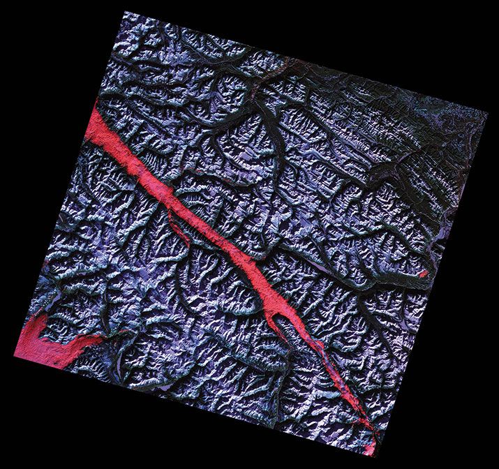
One of the things geologists look for in Landsat images are geometric shapes: circles and lines, which can indicate faults, or breaks in the crust. The ridges that ring the Brandberg Massif are an example of circular faults. Faults more often show up as straight lines; in either case, the scale may elude geologists working in the field. “It could continue on for maybe 10 or 20 kilometers,” says John Spray, “but when we’re down in the woods in that valley, we don’t know how big it is.” From space, scientists can see its full length and determine where to target ground studies.
One of Earth’s longest ancient fault lines stretches nearly 1,000 miles, from Flathead Lake, Montana, almost to the northern border of British Columbia in Canada. “The Rocky Mountain Trench gives us a picture of a historical event that started over 100 million years ago,” says Charles Trautwein. The first part of the action was the sliding of the Pacific tectonic plate. As it moved under the North American plate, it ruptured the overlying rocks. Over several ice ages, explains Trautwein, the repeated advance and retreat of glaciers scoured out canyons, scraping away structurally weakened rocks and forming the impressive Rocky Mountain Trench.
Linda Shiner is the editor of Air & Space.